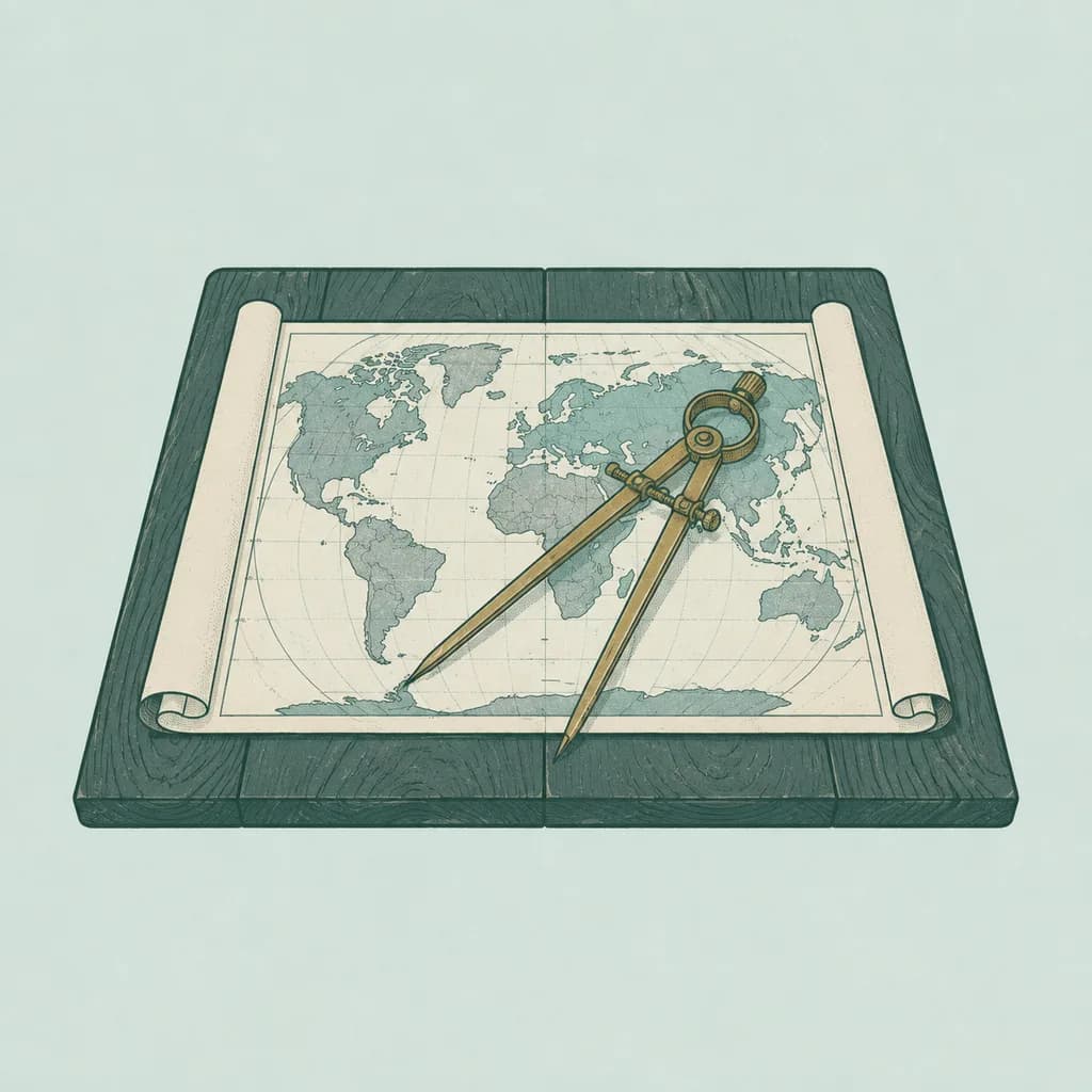
Find a map of the world — the famous one, the one that hung on the wall of your school. Look at the top. Greenland sits there, huge and white, about the same size as the whole of Africa.
Now the truth: Africa is about fourteen times bigger than Greenland. It is big enough to hold China, India, the United States and most of Europe inside it at the same time, with room left over. The map on your school wall was lying to you, every single day, for years.
It wasn't lying by accident. It was lying by design, and the design is beautiful.
Here is the problem every mapmaker faces: the earth is round, and paper is flat. If you peeled an orange and pressed the skin flat on a table, the skin would tear. A round skin simply does not want to lie flat. So every flat map must cheat somewhere — it must stretch some part of the world, or cut it. The only choice a mapmaker has is where to put the lie.
In 1569, a mapmaker called Gerardus Mercator chose. His customers were not children at school; they were sailors, and sailors in those days died again and again because they lost their way at sea. Mercator built a map with one magical property: a straight line on his map is a single, fixed compass direction in the real world. Draw a line from where you are to where you want to go, read the angle, keep the ship's compass on that angle, and you arrive. No hard thinking in a storm, no guessing. It is hard to say how many lives that one idea saved.
But the magic had a price. To keep the compass lines straight, Mercator stretched the far north and the far south — and the nearer to the poles, the harder the stretch. Places near the equator stay true. Places near the top of the map swell and swell. Greenland becomes a monster. Alaska looks bigger than Mexico; it isn't. India looks small next to Europe; it is three times the size of the biggest country in it. Russia and Canada, both far in the north, look even bigger than they really are.
None of this worried the sailors — no one travels to a country's size. The map was drawn for ships, not for schools. The trouble began when schools started to use it anyway, and they used it for four hundred years. Whole generations grew up with the far north swollen and the middle of the world pressed thin, and no one mentioned it in class.
Does it matter? Some people think it quietly changed how we see the world — the rich north printed huge, Africa and India printed small. Whether or not maps change minds, the numbers themselves are worth knowing, because they surprise almost everyone who meets them. Africa is not "a bit bigger" than it looks. It is far, far bigger. Greenland goes into it fourteen times.
And here is the final joke: the map in your pocket is the same map. The maps on our phones use a modern version of Mercator's design, because his old magic works just as well on a screen — straight streets stay straight, square blocks stay square, and the picture looks clean at every zoom. On your phone you almost never look at whole continents, so the old lie almost never gets its chance.
But it is still there. Tonight, if you like, open the map and zoom all the way out. Greenland will sit at the top, huge and innocent, telling you the same beautiful, useful lie it has told for four and a half centuries.